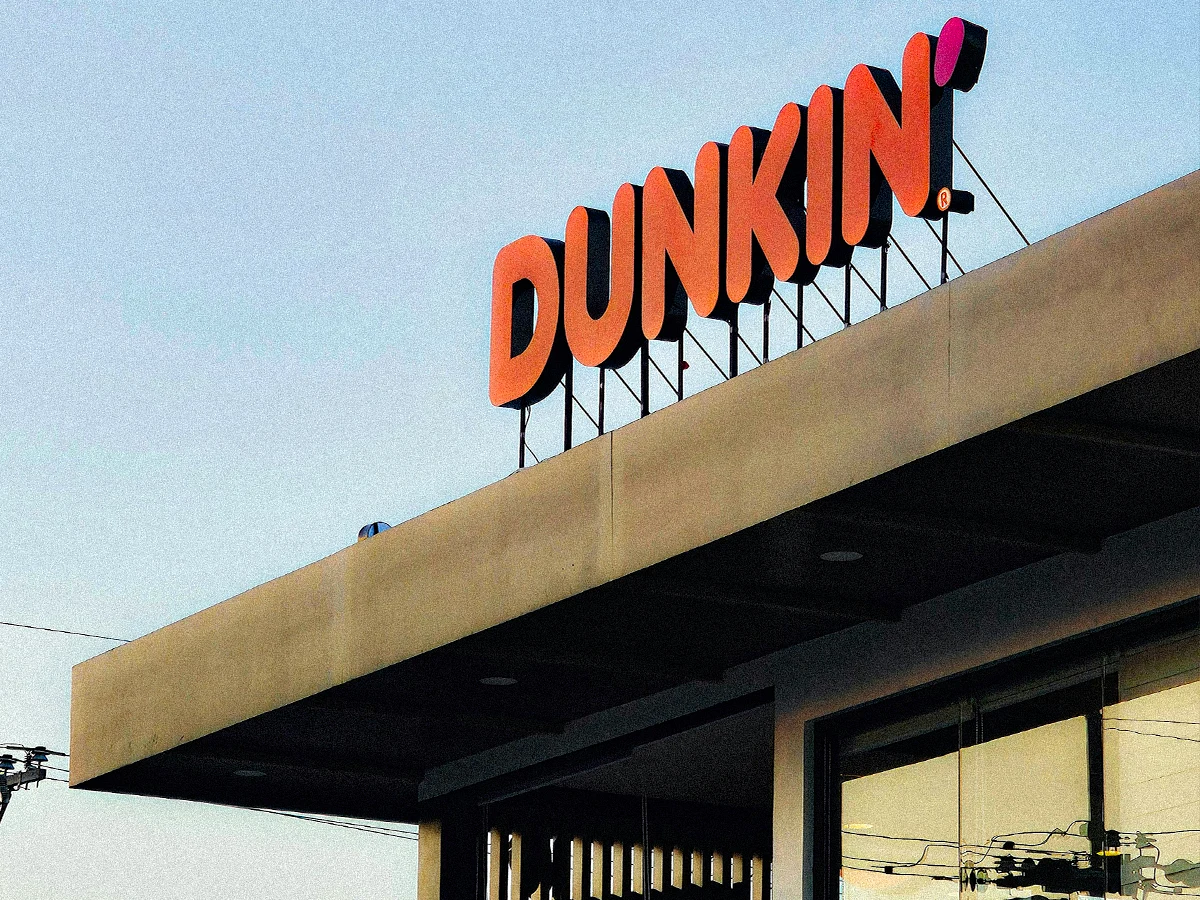
When the word carrying the pink got deleted, Dunkin' moved the pink to an apostrophe.
Every brand carries two halves. One half explains what the business does. The other half identifies who the business is.
The explaining half has a rationale behind it. Someone wrote it and someone approved it, and there's a person in the room who can defend it out loud. The identifying half is usually smaller, older, and harder to justify.
Your customers use the second half. Most companies protect the first one.
Your Brand Has a Half That Explains and a Half That Identifies
The explaining half is the language. The category word in your name, the tagline, the descriptor under the logo, the positioning line on the website. It tells a stranger what you sell.
The identifying half is the recognition cue. The color, the shape, the silhouette of your name, the thing someone spots at forty miles an hour. It tells a person who already knows you that they've found you.
Dunkin' sorted its brand into those two halves in 2018 and acted on the difference. The word Donuts explained the business. It didn't identify it.
The Half You Can Defend in a Meeting Is Rarely the Half Customers Use
Lucia DeRespinis drew the Dunkin' Donuts logo in the mid-seventies at Sandgren & Murtha. Here's how she's described choosing the colors:
"I said if you really want to do a good job, you take that hot dog lettering and you make it pink and orange, my daughter's favorite colors for her birthday party ever since she was 3 years old."
Source: Egg Collective, Designing Women, on Lucia DeRespinis. The "hot dog lettering" is Frankfurter, released by Letraset in 1970.
That brief wouldn't survive a single brand review today. There's no rationale in it and no research behind it. You couldn't take it to finance without feeling ridiculous.
Fifty years later, those colors are one of the most valuable things the company owns. The rationale that would have won the meeting is gone. The birthday party colors are still on the sign.
Dunkin' Ran the Short Name in Its Advertising for Twelve Years Before It Touched a Sign
The name change looks like a 2018 decision. It was the last step in a sequence that started in 2006.
"America Runs on Dunkin'" launched on April 10, 2006, created by Hill Holliday. For twelve years the company said the short name out loud in every campaign. The long name stayed on every building.
Then a test store in Pasadena in August 2017. A next-generation concept store in Quincy in January 2018. A trademark application filed on January 25, 2018, eight months before anyone heard about it. The public announcement on September 25, 2018.
Then the detail almost everybody misses. Signage changed only at new and remodeled locations, per the company's own release. The most expensive, most physical recognition cue changed slowly and unevenly, one parking lot at a time.
They tested the name in the cheapest layer they had. Advertising is reversible. Signage is capital.
When the Word Carrying the Pink Got Deleted, the Pink Moved to the Apostrophe
The old logo was DUNKIN' in orange stacked over DONUTS in pink. Deleting the second word would have taken half the color pairing with it.
So they put the pink somewhere else. Compare the two federal registrations:
Reg. 4600316: "The mark consists of the word 'DUNKIN'' in orange over the word 'DONUTS' in pink."
Reg. 6034266: "The mark consists of the stylized word 'DUNKIN'' in orange followed by an apostrophe in pink."
Sources: USPTO Reg. 4600316 and USPTO Reg. 6034266.
Half the color pair survived by relocating to a piece of punctuation. Somebody decided the pink itself was worth keeping. Then they gave it the smallest character on the sign.
That's what protecting a recognition cue actually looks like. It's a decision to keep a color that has no argument attached to it.
Customers Noticed the Name and Almost Nobody Noticed the Colors
Two measurements exist, and together they say something more useful than "nobody noticed."
YouGov BrandIndex tracked the announcement. Buzz rose from 12 to 21. Word of Mouth went from 15% to 23% of US adults recalling discussion of the brand. The average over the prior nine months was 17%. Purchase Consideration moved from 28% to 30% and settled back at 28%.
Then, two years later, Visual Objects asked 501 US adults what they had noticed. 34% spotted the new name. 32% spotted the new logo. 10% mentioned the colors. 13% said they saw no difference at all. That one is an agency survey with partial method disclosure, so treat it as indicative rather than definitive.
Read those two together. People talked about the name for a week and intent to buy didn't move. The colors carried the recognition without ever entering the conversation.
The name got the attention. The colors did the grounding work.
The Assets Were Never Working One at a Time
Here's where most brand measurement goes wrong, including the research a studio like ours leans on.
Ipsos and JKR tested 5,046 brand assets across 523 brands and 33 categories. More than 26,000 respondents, 25 countries, published June 14, 2023. Only 15% of assets qualified as distinctive. By type: the product itself at 31%, logos at 19%, mascots at 16%, slogans at 6%, and colors at 4%.
Sit with the slogan number. 6%. Your tagline is the asset with the most meetings attached to it and the least recognition riding on it. It gets the workshop and the board review, and it measures near the bottom.
Part of that disproportion is fair, because a bad tagline can sink a good campaign. Still. 6%.
But every one of those assets was tested alone, stripped out of its brand and shown by itself. That's the right way to score a single asset. It's the wrong way to answer what happens when you remove one.
Dunkin's colors weren't carrying recognition by themselves. They carried it alongside the lettering, the cup, the sign geometry, and a name people had heard since 2006. Take one of those out and the others absorb the load.
Which is also the honest version of "they can't touch it." Dunkin' did change things. Colophon built custom type families for them, including a lowercase the original lettering never had. The color pair and the shape of the name on the sign are what they wouldn't give up.
Pick the Two You'd Fight For
Branding stays ambiguous in exactly this way. You can put your best people on it, and your customers still decide what your brand is. Data gets you partway, and then you're dealing with recognition, which is closer to reflex than reasoning.
So run the exercise on your own brand before someone runs it on you. Line up three things. The tagline your team spent six weeks writing. The name you've outgrown. The color a customer uses to spot your sign from across a parking lot.
Two of those can change without anyone getting lost. Be honest about which one you'd fight for.
Most teams already know which asset is unprotected. It's the one nobody has a document for.
Which asset in your brand got the most meeting time this year? And which one would a customer actually use to find you?
Common Questions
What should you never change in a rebrand?
Change the parts that explain the business and protect the parts that identify it. Category words and taglines carry meaning, and meaning can be rewritten. Colors and shapes carry recognition, which took years to build and can't be rebuilt on a deadline. If customers use it to find you, protect it.
Did Dunkin' change its logo colors in 2018?
No. The pink and orange stayed, and the pink relocated. The old registration described DUNKIN' in orange over DONUTS in pink. The current one describes DUNKIN' in orange followed by an apostrophe in pink. Deleting the second word would have removed half the pairing, so they moved the color instead.
Why did Dunkin' drop the word Donuts?
The company had been calling itself Dunkin' in its own advertising since April 2006. That's when the "America Runs on Dunkin'" campaign launched. Twelve years later the sign was the only place still carrying the longer name. The word explained the category, and by then it wasn't doing recognition work.
How long does a name change take to stick?
Nobody has published a reliable number, and any vendor who gives you one should be asked for the study. What's measurable is the sequence. Dunkin' ran the short name in advertising for twelve years and tested it in two stores. Then they filed the trademark eight months early and changed signage only at new locations.
What's the cheapest place to test a brand change?
Advertising and campaign work, because both are reversible within a quarter. Logos cost more. Names are close to permanent, and signage is capital expenditure. Dunkin' moved through those layers in that order over twelve years. The last step looked sudden to everyone who wasn't watching the first four.
This Was Originally a LinkedIn Post
This article started as a LinkedIn post. If you're into that kind of thing, I post a few times a week. The link's just below.



Get a quick temperature check:
Give the basics, get as deep as you want, and get an instant estimate with a number reliable enough to take to the decision table.